Logo design for Housing Associations
Respecting your past, and designed for your future
Logos and branding you can be proud of
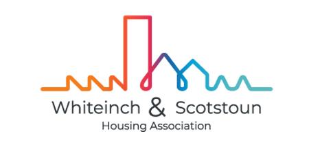
Whiteinch & Scotstoun Housing Association
This logo is based around the physical environment and the reasons why Whiteinch and Scotstoun areas exist in the first place.
Glasgow, like many great cities, was established around its river, the River Clyde.
From this river came great industries, and the industries needed homes to accommodate the many workers that flocked to the city.
The logo takes the idea of a twisting flowing river and uses that to shape the various types of buidings we see in Whiteinch and Scotstoun, including; factories, high rise, and dwellings.
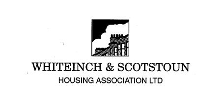
The original logo for Whiteinch & Scotstoun Housing Association is pretty typical of logos for that time, where a drawing of a typical building in the community was used, along with the name of the organisation.
Organisations tend to stick with their logo/branding for a long time and this logo managed over 40 years of service, however the association decided it was time to convey a brighter vision of the future, whilest retaining the roots and foundations on which the areas were established.
What does your logo say about your organisation
More importantly what should it be saying?
Are you conveying an image of who you are or who you are becoming?
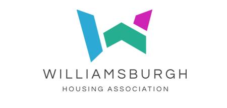
Williamsburgh Housing Association
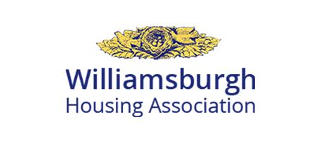
The original Williamsburgh Housing Association logo was using an older font and a complex birds nest icon, and it is fair to say it was looking dated.
It also had the issue of people not really knowing what the icon part was, especially when seen at a smaller size.
The brief was to create something modern and simple that could easily be displayed across multiple media, including the new website, letterheads, and livery on vehicles.
However we also wanted to create something very distinctive, that could be recognised very quickly, as well as being simple too.
The “W” was the solution we landed on, and it was made more interesting and recognizable by separating the parts and changing the colours.
The use of a more modern spaced out font for the “Williamsburgh Housing Association” words added to and enhanced the transformation.
Would your organisation benefit from having a new modern visually appealing logo?
Logos can convey either the right or wrong message about you
Is your logo doing its job properly?
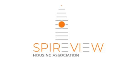
Spire View Housing Association
Spire View Housing Associations original logo was based around the tall church spire that dominated the skyline on its elevated position within the community it served.
From a design perspective it was a product of its time and encapsulated the spire, tenemental housing, the hill it sat atop, and of course the name of the housing association itself.
The spire is still very much at the heart of the community and remains an integral part of the community’s identity, and it was important to retain this identity within the new logo.
However we didn’t just want to create another “realistic” looking spire.
We wanted to put a more modern slant on it, and further push the idea that the spire is as important to Spire View Housing Association today as it has always been to the community.
"SPIREVIEW" and the spire have become one, forever connected.
Is your logo making a good first impression?
Or are you just ready to have a new logo?
Get in touch and start the conversation